Projects / 06 · Media and blogs · blog about Japan
Jerzy Ciszewski
A blog about Japan and painting, designed as a metro map



Home page
Jerzy Ciszewski is a pioneer of Polish PR who writes about Japan and paints. I designed his blog so that topics are lines and posts are stations.
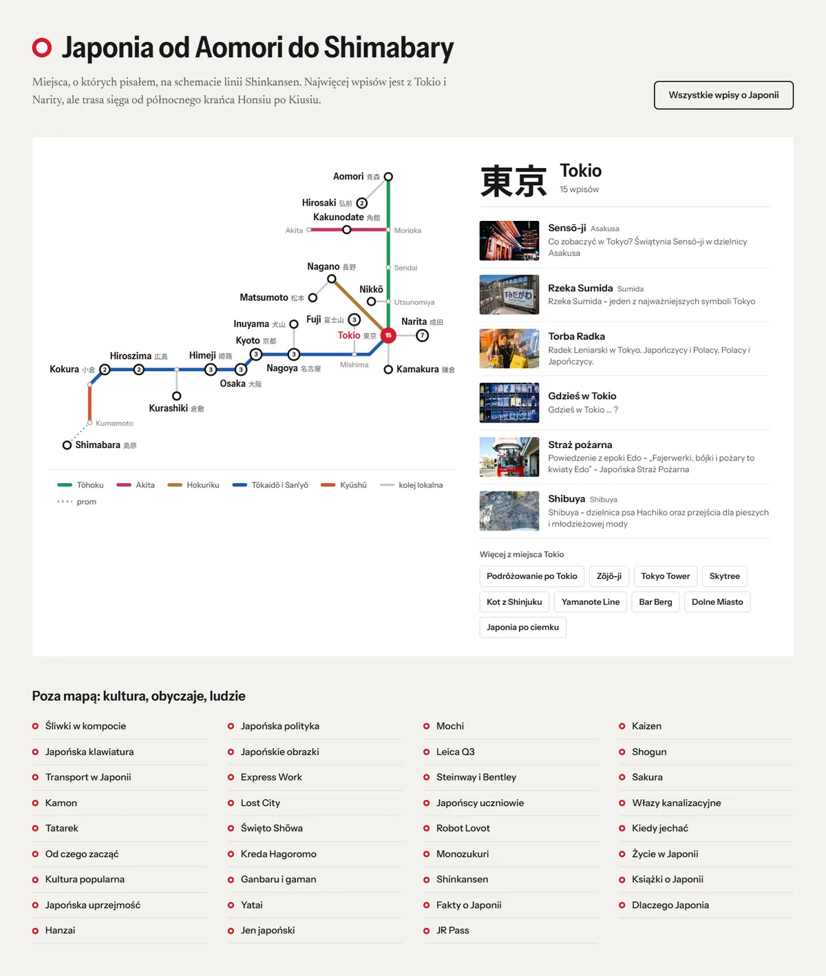
Japan from Aomori to Shimabara
The Shinkansen rail diagram shows 19 places from the posts, labelled in Polish and Japanese. Clicking a station displays its posts, and on mobile the map turns into a vertical route.
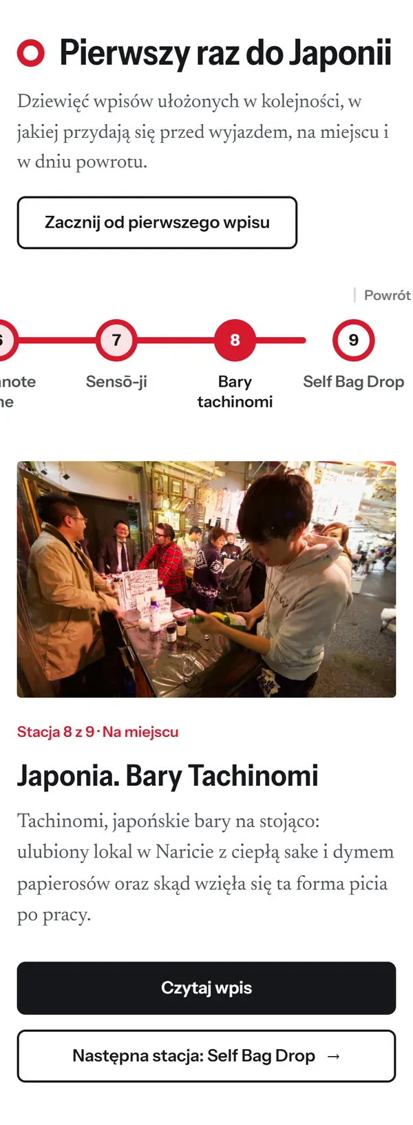
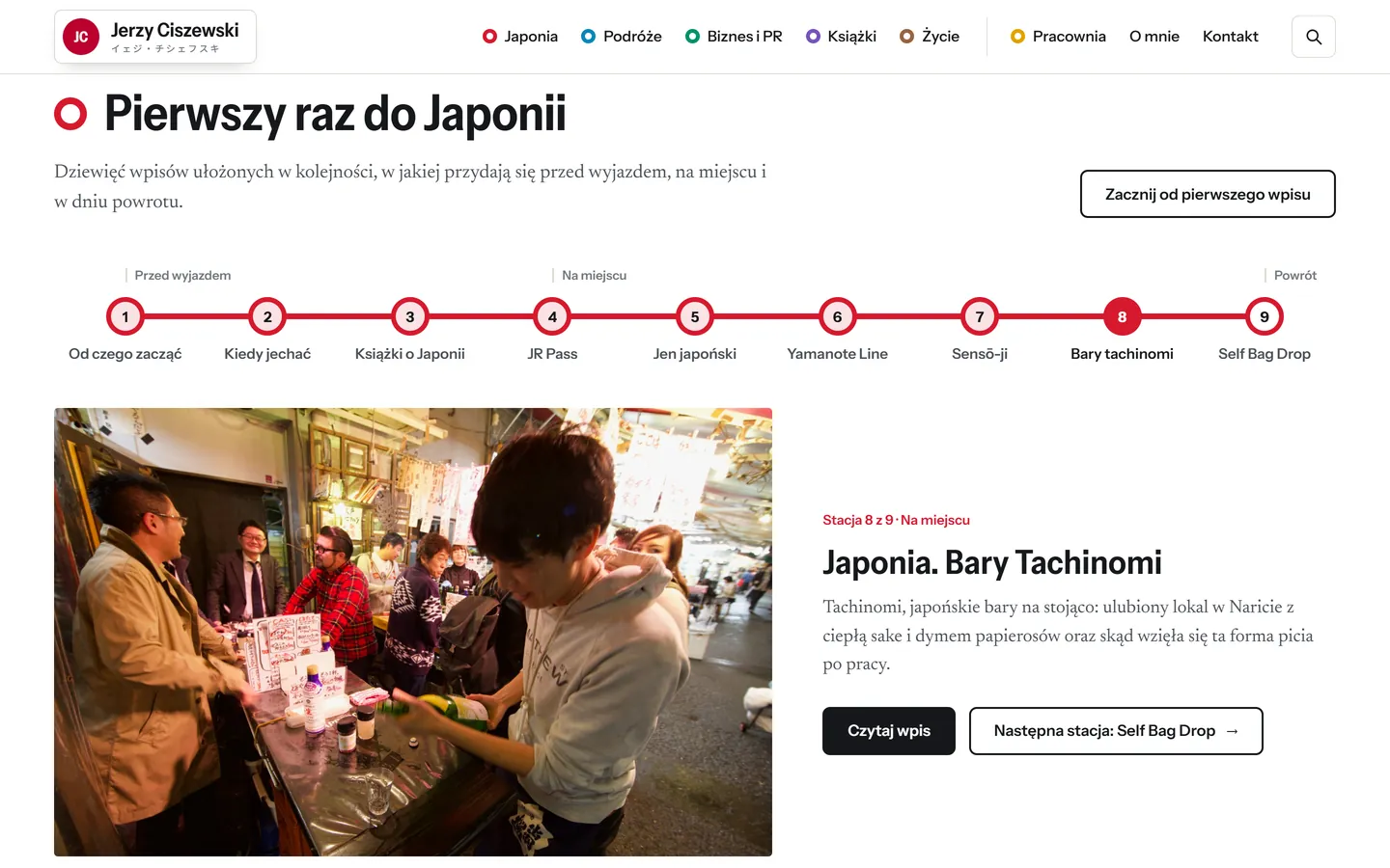
First trip to Japan
Nine practical posts are arranged in travel order, from preparation to the journey home, and the “Next station” button leads to the following post.
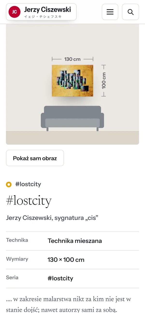
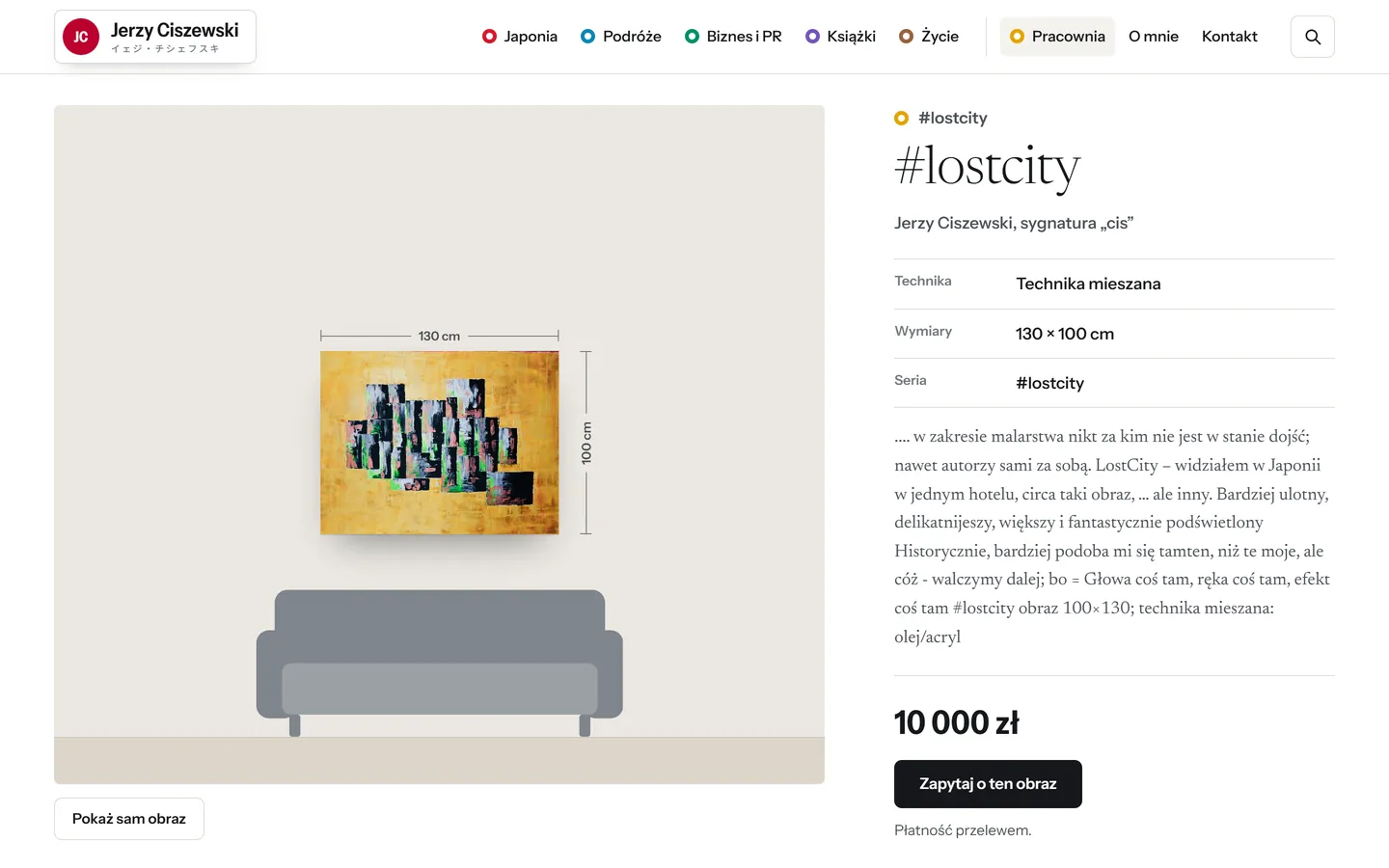
Painting to scale above a sofa
The painting page with dimension lines shows the work above a 2 m wide sofa, with its medium, dimensions and an “Ask about this painting” button alongside.
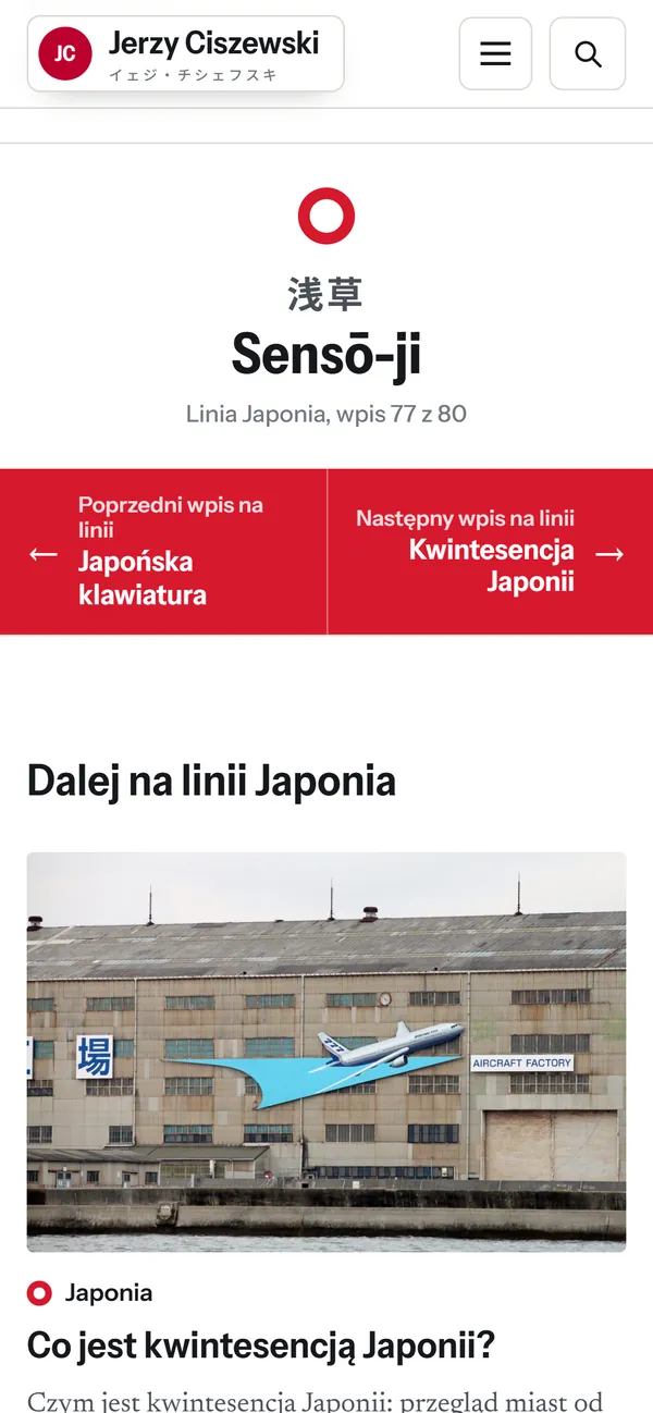
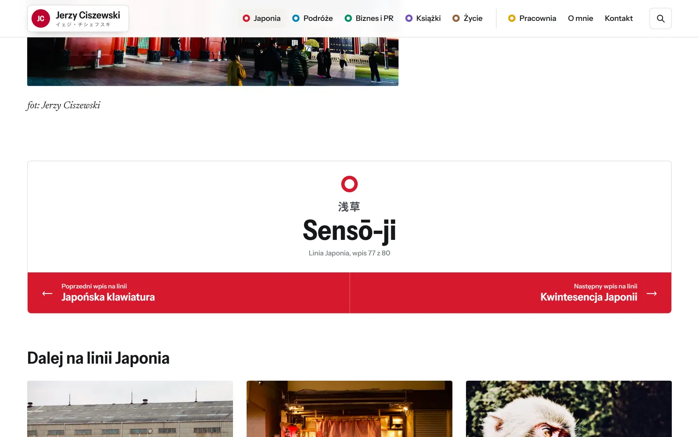
Station sign closing each post
Each post ends with a sign like those on Japanese railway platforms, showing the station name in Japanese and the previous and next posts on the same line.
Jerzy Ciszewski founded one of the first public relations agencies in Poland, and on his blog he writes mainly about Japan, travel and painting. I organised all 121 posts in a catalogue, designed the blog like a metro map with six topics as lines and posts as stations, and presented the paintings from his studio to scale. Readers move from post to post as if following a route, and buyers can judge the size of a painting before asking the author about it.
- Industry
- Media and blogs · blog about Japan
- Year
- 2026
- Scope
- Concept and visual design, Logo and favicon, Information architecture, Theme development, Post catalogue, Testing at 5 screen widths
- Technologies
- WordPress, Custom theme without jQuery or a page builder, WooCommerce (studio shop), Map and diagrams in SVG, Instrument Sans, Newsreader, Noto Sans JP (self-hosted), Post catalogue in JSON, Preview via an mu-plugin that blocks database writes
- Website
- Redesign, not yet live
01Challenge
The blog has 121 posts across six different fields, from railways in Japan to communication crises in business, and a standard category layout did not show how these topics connect. Readers needed to see at once what the author writes about and where to go next, and buyers needed to judge a painting’s size on the wall before enquiring about it.
02Solution
- I analysed the 121 posts and divided them into six lines in the colours of the Tokyo metro, marking posts that combine two topics as interchanges.
- I created a Shinkansen rail diagram with 19 places from the posts, and a route of nine practical posts for people travelling to Japan for the first time.
- I developed a painting page with dimension lines and a to-scale view above a 2 m wide sofa, so that buyers can judge the size before enquiring.
- I ended each post with a sign like those on Japanese station platforms, which shows the previous and next posts on the same line and leads readers onwards.
03Key website features

- 01
Japan from Aomori to Shimabara
The Shinkansen rail diagram shows 19 places from the posts, labelled in Polish and Japanese. Clicking a station displays its posts, and on mobile the map turns into a vertical route.
- 02
First trip to Japan
Nine practical posts are arranged in travel order, from preparation to the journey home, and the “Next station” button leads to the following post.
- 03
Painting to scale above a sofa
The painting page with dimension lines shows the work above a 2 m wide sofa, with its medium, dimensions and an “Ask about this painting” button alongside.
- 04
Station sign closing each post
Each post ends with a sign like those on Japanese railway platforms, showing the station name in Japanese and the previous and next posts on the same line.
04The project in numbers
Arranged on six lines, the 121 posts show readers how the author’s topics connect.
Papaya Sushi Bar →
A sushi bar website where guests order in a single window